I constantly speak to brilliant commercial contractors who lose bids to competitors using inferior materials and a fraction of the experience. It drives them insane. They cannot figure out why the developer chose the "worse" builder. But here's the brutal truth: the developer didn't know they were worse. The competitor simply looked more expensive. This is the lethal power of a meticulously engineered B2B brand identity.

When we talk about "branding" in the construction industry, 90% of contractors immediately think of the sticker on the side of their truck. They view branding as a superficial, artistic exercise—something you pay a college kid $500 on Fiverr to draw up so you can slap it on a hardhat.
Personally, I think that is the most expensive mistake a firm can make.
In the high-stakes, B2B commercial sector, your brand is not just a logo. Your brand is the subconscious heuristic (the mental shortcut) that a developer uses to judge your competence, your reliability, and ultimately, whether you are worth your premium margin. If your visual identity looks cheap, scattered, and dated, the buyer's brain will automatically assume your construction practices are cheap, scattered, and dated. It’s an unavoidable psychological reflex known as the Halo Effect.
The Halo Effect: Why Visuals Dictate Pricing Power
The Halo Effect is a cognitive bias where a person's overall impression of a company directly influences their feelings and thoughts about that company's specific services. If you walk into a Michelin-star restaurant and the silverware is perfectly polished, the lighting is meticulously controlled, and the menus are heavy cardstock, you subconsciously expect the food to be incredible before you even take a bite. And just as importantly, you expect it to be expensive. You are pre-conditioned to accept a premium price point because the environment radiates competence and exclusivity.
Contractors repeatedly fail to apply this logic to their own business.
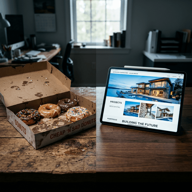
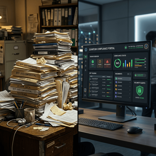
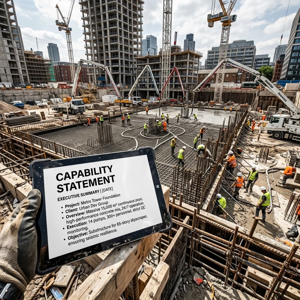
Imagine a property manager receiving two competing bids for a $3 million tenant improvement. Bid A arrives in a generic manila folder. The logo looks like 1990s clip art. The contractor’s email signature contains a pixelated JPEG that hasn't been updated in twelve years. Their website is broken on mobile.
Bid B arrives in a matte black, soft-touch presentation folder with a minimalist, deeply debossed logo. The typography is modern and razor-sharp. The proposal document feels like a luxury architectural magazine. When the property manager visits Bid B’s website on their phone, it is a lightning-fast, sleek, user-friendly marvel showcasing cinematic photography of past projects.
Even if Bid B is 15% more expensive, the property manager's brain has already decided that Bid B is the "safer" choice. Why? Because the flawless execution of their branding implies flawless execution on the job site. The property manager is not a structural engineer; they cannot judge your steel-tying technique. They judge what they can see. If you care enough to perfectly kerning the letters on your proposal deck, they assume you care enough to perfectly align the custom millwork in the lobby.
The Race to the Bottom
If your visual identity looks identical to every other "Joe's Construction" in your city, you cannot mathematically command a premium margin. You have commoditized yourself. You are forcing the buyer to decide strictly based on price, and in a commodity market, the cheapest player wins. That is a miserable, exhausting way to run a company.
Deconstructing a Luxury B2B Visual Identity

Stop and look at the aesthetic of ultra-luxury fashion brands or high-end architectural firms. What do you see? You do not see chaotic neon colors. You do not see cartoon mascots. You see negative space, stark minimalism, and authoritative typography.
When executing a rebrand for an 8-figure construction firm, we don't just "design a logo." We architect a holistic visual system. Every touchpoint must reinforce the perception of unyielding quality and reliability. Let's break down the pillars of this visual strategy.
1. The Strategic Color Palette
In construction, 90% of companies default to safety yellow, caution orange, or a generic, hyper-saturated blue. While yellow and orange are great for safety visibility, they do not communicate "executive luxury" to a corporate board of directors.
To position a builder at the premium tier, we shift the psychology. Deep charcoal, slate greys, onyx black, and midnight blue communicate power, stability, and intelligence. Instead of bright safety yellow, we accent with metallic gold, brushed brass, or a muted, earthen green. This palette immediately elevates the brand out of the "blue-collar commodity" bucket and places it alongside financial institutions and corporate law firms—which happens to be exactly who you are selling to.
2. The Authority of Typography
The font you use is the tone of voice your silent brand speaks in. Thick, blocky, distressed fonts scream "cheap residential handyman."
An 8-figure brand utilizes crisp, geometric sans-serif fonts (like Inter, Montserrat, or bespoke architectural typefaces). These fonts convey exactness. They imply that your firm calculates tolerances to the millimeter. Alternatively, a highly modern serif font can evoke a sense of heritage and established trustworthiness, signaling that your firm has been stably executing massive projects for thirty years.
The Psychology of the Sunk Cost Pitch
Allow me to introduce you to the Sunk Cost psychological trigger. Corporate buyers are humans, and humans hate looking foolish. When a developer hires an architect to design a breathtaking $15 million corporate headquarters, they have emotionally committed to a luxury outcome. If they hire a contractor whose brand looks like it operates exclusively out of the back of a 1998 Chevy van, their brain experiences massive cognitive dissonance.
They think: "How can this guy build my luxury glass atrium when he can't even afford a functioning website?"
This is where premium branding wins. By presenting a brand identity that looks unequivocally expensive and sophisticated, you validate their existing desire for a high-end outcome. You make them feel safe in writing the massive check. They will happily pay a 12% premium just to eliminate the anxiety of hiring someone who doesn't matching their aesthetic standards.
Commodity Mindset vs Value Mindset
Have you ever noticed that contractors who compete exclusively on price are always the most stressed, overworked, and creatively exhausted people in the industry? That is the commodity mindset.
When you refuse to invest in your brand, you effectively tell the market: "There is nothing special about us. We pour concrete exactly like the guys down the street, so you should just pick whoever is cheapest."
A value mindset contractor behaves entirely differently. They charge $50,000 more for the exact same concrete pour, and they win the bid because their brand narrative implies superior project management, zero costly delays, and a vastly superior safety record. They aren't selling concrete; they are selling peace of mind. And you cannot successfully sell peace of mind if your visual branding looks chaotic and unprofessional.
The Digital Command Center: The Website

Does this scenario resonate with you? You meet a massive potential client at a networking event. You shake hands, you exchange cards, and you have a phenomenal 20-minute conversation. You walk away thinking you have secured the bid. The very first thing that executive does when they get back to their car is type your URL into their smartphone.
If your website takes 6 seconds to load, features tiny illegible text, and requires them to pinch-and-zoom to navigate your portfolio, that incredible 20-minute conversation is instantly destroyed. It vaporizes. You have just demonstrated that you cannot manage your own digital properly; why on earth would they trust you to manage a multi-layered logistics and supply chain schedule for a $10 million warehouse?
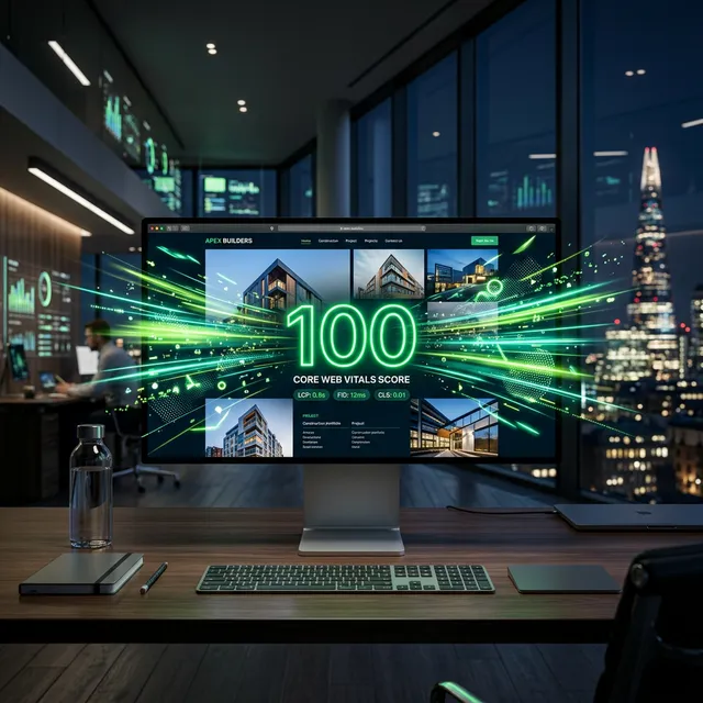
A premium website is the ultimate digital flex. It must be brutally fast, achingly beautiful, and obsessively mobile-optimized. In the premium sector, we utilize dark mode aesthetics prominently. Not only does dark mode feel sleek and modern, but it acts as a dramatic theater screen, making high-saturation architectural photography absolutely explode off the page. The website is not a digital brochure; it is a 24/7, high-ticket salesperson that proves you operate at the bleeding edge of the industry.
The Law of Congruency
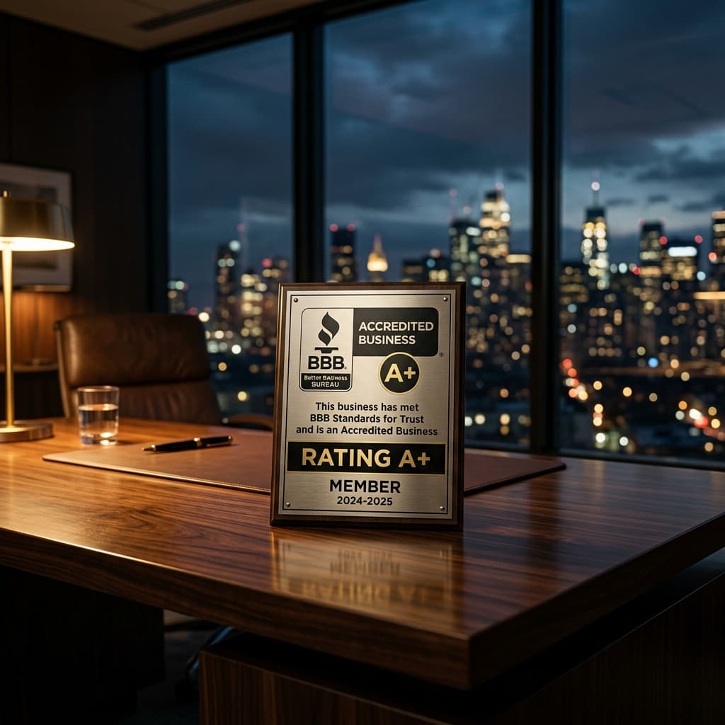
You cannot have a $10,000 website but send proposals from an @yahoo.com email address. You cannot have a brilliant logo, but let your crew show up to the site in torn, stained tank tops. The psychology of branding relies entirely on congruency. A single, glaring inconsistency creates a psychological "red flag" in the buyer's brain. If you want the premium contract, every single touchpoint must execute flawlessly.
Building Brand Equity Before the Pitch
In high-ticket commercial construction, the sale is almost entirely won before you ever step foot in the boardroom. The developer has already researched your firm meticulously. They have looked at your LinkedIn profile, they have scoured your website's portfolio, and they have analyzed the quality of your recent project photography.
This is what B2B marketers call "Brand Equity." It is the invisible accumulation of trust and prestige that your brand generates before a conversation ever occurs. If your visual identity is flawlessly executed across all platforms, you walk into that pitch meeting with a massive psychological advantage. The prospect is already predisposed to like you.
Conversely, if your brand equity is negative—if your website looks cheap and your photography is blurry—you have to spend the first 30 minutes of the pitch desperately trying to convince the developer that you are actually competent. You are playing from behind. A premium visual identity does the heavy lifting for you, allowing your sales team to focus on the actual project logistics instead of begging for credibility.
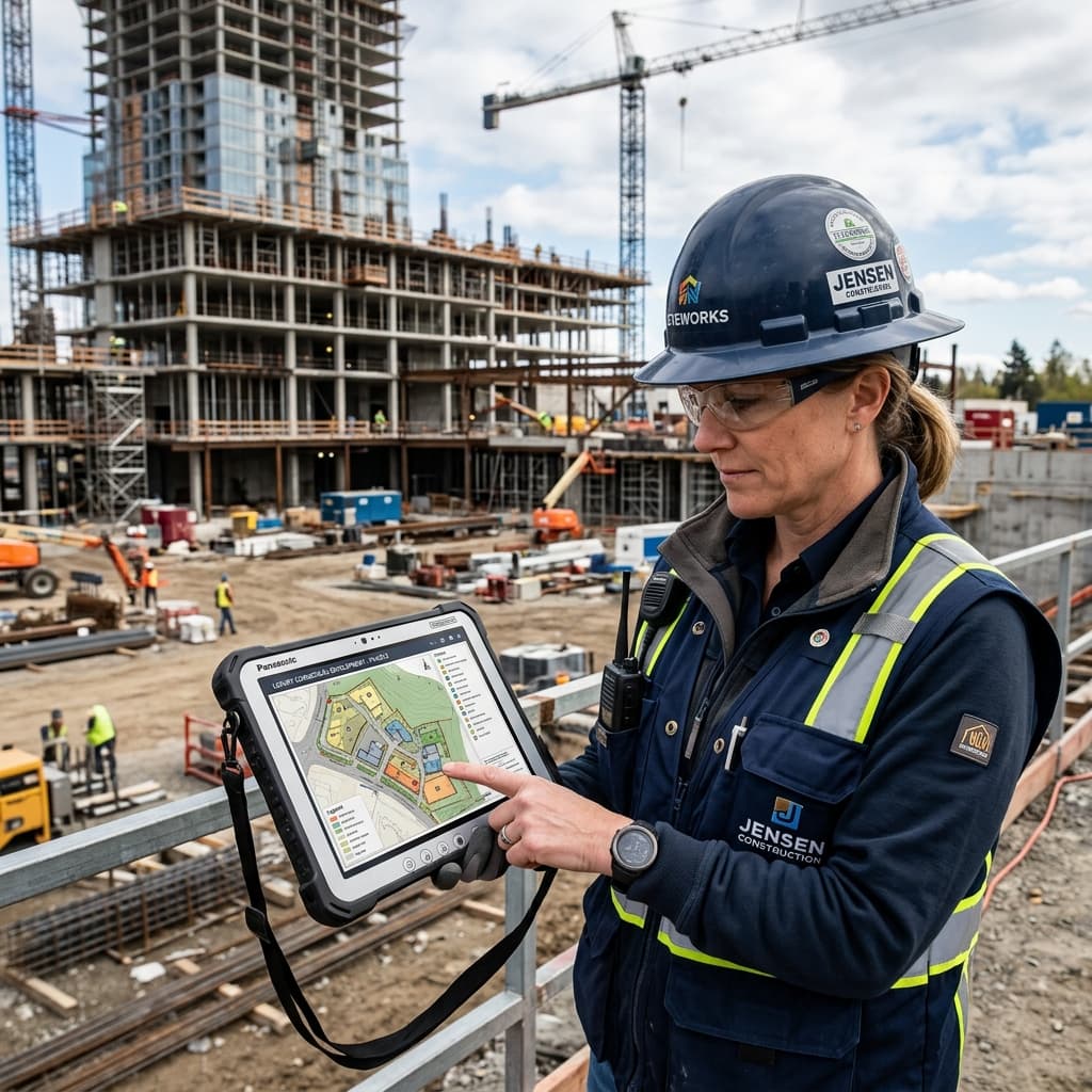
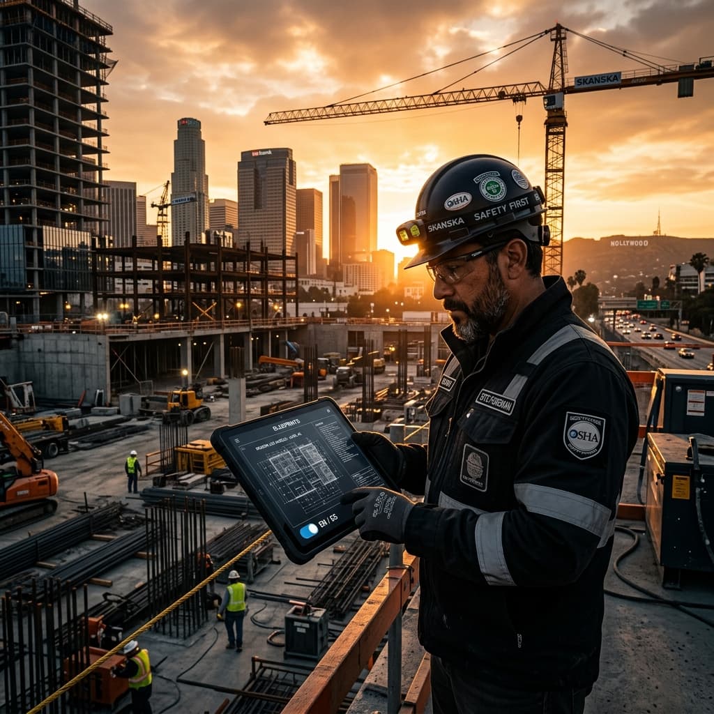
The Real-World Translation: Job Site Branding
Digital presence is crucial, but construction happens in the dirt. Your real-world presence must reflect the exact same level of high-end obsession.
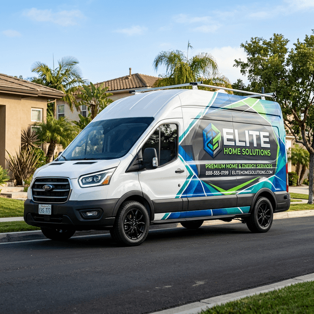
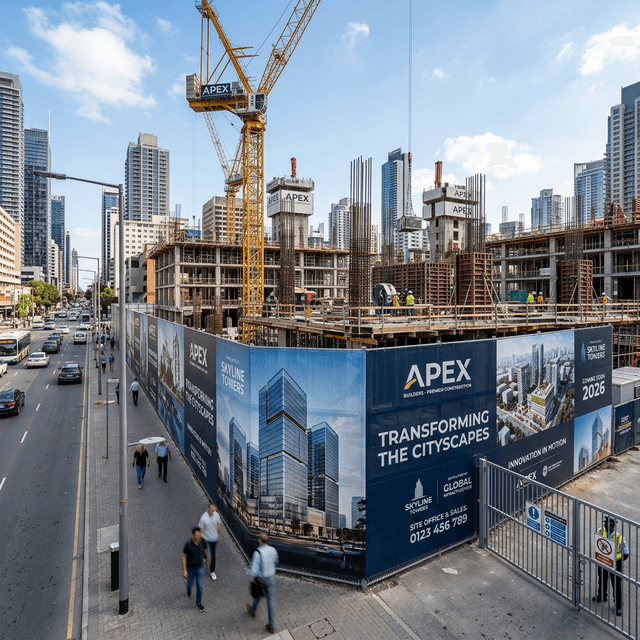
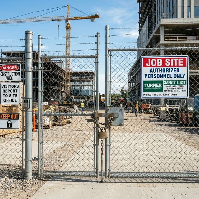
Start with the job-site fencing. Instead of generic chainlink wrapped in cheap, translucent green mesh, high-end builders deploy taut, heavy-duty black privacy screening emblazoned with massive, crisp, white vector logos. It transforms an eyesore construction site into a massive, highly professional billboard dominating a busy commercial intersection.
Now look at the uniforms. Are your superintendents arriving on site wearing faded neon shirts they got for free from a paint supplier three years ago? Or are they stepping out of their trucks in fitted, charcoal-grey, moisture-wicking polos with your brand mark cleanly embroidered in gold thread? When a developer visits the site unexpectedly, their blood pressure drops when they are met by a project manager who looks like an organized executive rather than a disorganized laborer. That visual calmness translates directly into trust, and trust translates directly into retention for the next project.
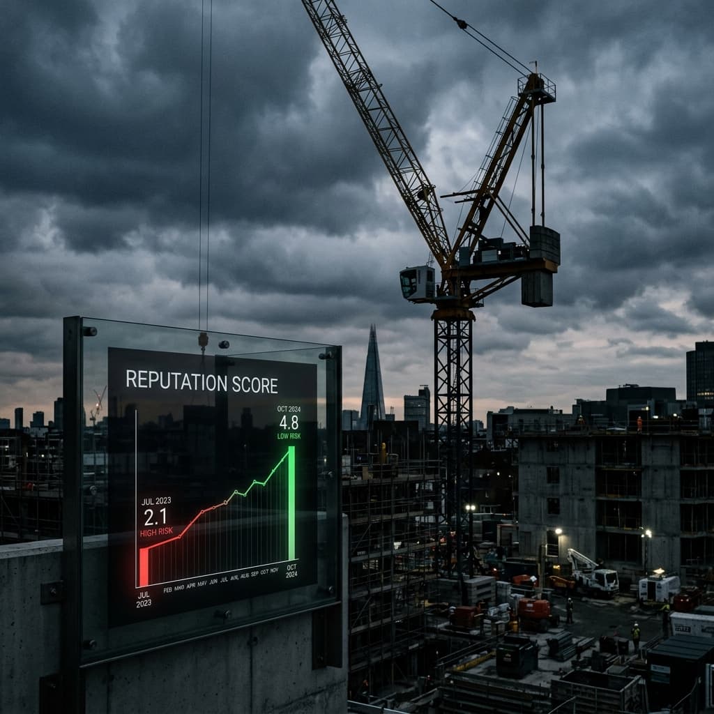
The Invisible ROI of High-End Branding
Contractors love hard numbers. They want to know that if they spend $10,000 on a rebrand, they will make $50,000 back in 90 days. But brand identity does not function like direct-response Google Ads. The ROI of premium branding is structural, not transactional.
When your brand looks incredible, three highly metric-driven things happen: First, your close rate increases because prospects inherently trust you more. Second, your cost of customer acquisition (CAC) plummets because your website converts a higher percentage of organic traffic. And third, your employee retention spikes.
Wait, employee retention? Yes. The best project managers, the best estimators, and the most elite superintendents do not want to work for a company that looks like a joke. They want to wear a uniform they are proud of. They want to hand over a business card that looks sophisticated. By building a luxury brand identity, you effortlessly attract and retain the top 1% of operational talent in your city. That talent executes perfectly on the job site, which leads to better case studies, which leads to larger contracts. It is an unstoppable, compounding flywheel of success.
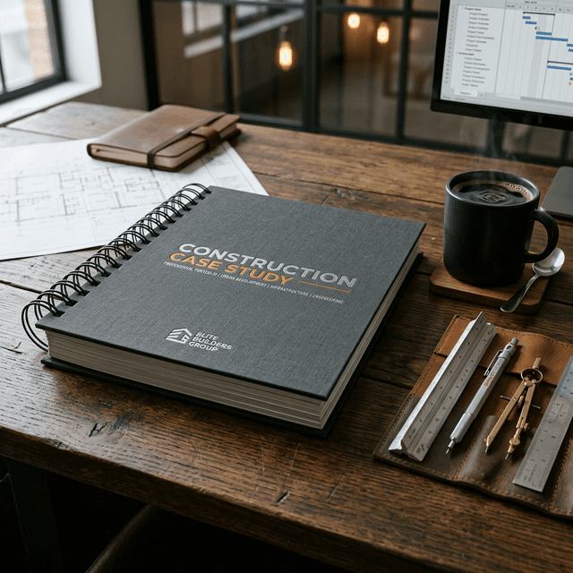
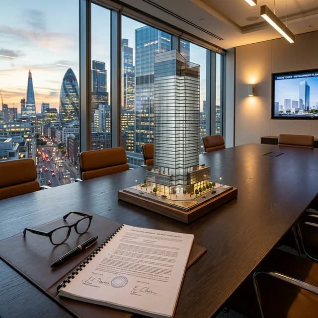
Sales Collateral That Closes 8-Figure Deals
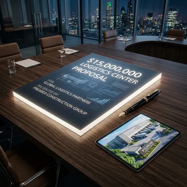
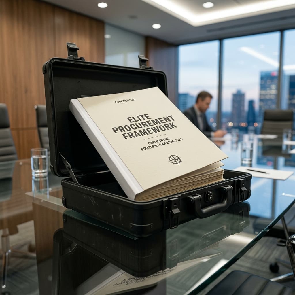
We cannot discuss brand identity without mentioning the actual physical pitch deck. The worst atrocity committed in the B2B construction space is the Microsoft Word proposal. Sending a $6 million commercial bid formatted entirely in Times New Roman on a white background should be illegal.
Your proposal document is the physical manifestation of your brand promise. It should be constructed in professional design software like Adobe InDesign or Figma. It needs heavy margins, massive full-bleed photography of your past triumphant builds, and hyper-legible pricing tables that exude total transparency.
When a developer sits at their desk reviewing four competing bids, your proposal should physically weigh more in their hands. It should feel like an architectural digest magazine. While the other three contractors submitted a mere spreadsheet, you submitted a comprehensive, visually stunning roadmap to their success. You didn't just give them a number; you gave them a luxury experience. That is how you obliterate the competition before the first shovel ever hits the dirt.
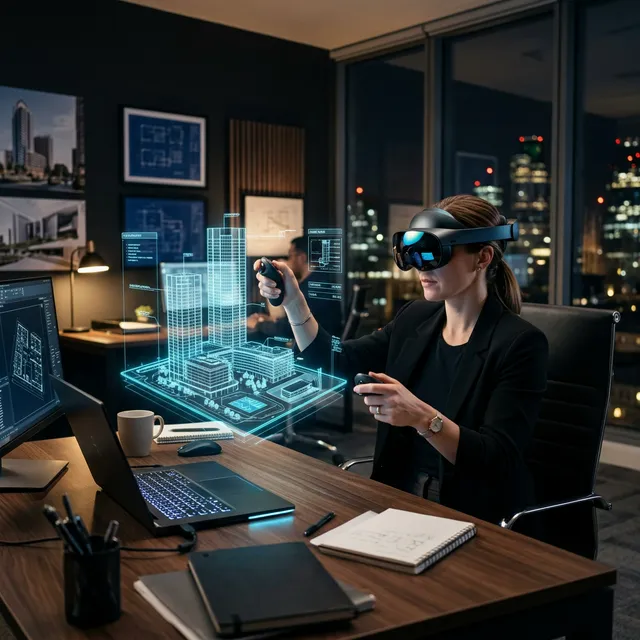
The Role of Micro-Interactions in Brand Storytelling
When a brand operates at the highest echelon of the market, the differentiation rarely comes from the macro movements. Every $100 million builder has a nice logo and a structured website. The true separation occurs in the micro-interactions. A micro-interaction is the two-second experience a user has when they engage with a specific, isolated piece of your brand infrastructure.
Imagine a developer interacting with your digital portfolio. They hover their mouse over a project tile. Instead of remaining static, the image smoothly scales to 105% size, a sleek metallic gradient washes over the text, and a deeply satisfying, subtle UI shadow emerges. Or imagine your onboarding sequence: when a contract is signed, the client automatically receives a beautifully branded, password-protected portal link granting them real-time live drone feeds of the site excavation.
These are micro-interactions. They are entirely unnecessary for the structural completion of the building. But psychologically, they are nuclear. They signal to the subconscious mind that this firm cares so deeply about the minutiae of the client experience that they literally engineered custom software states just to make hovering over a picture feel luxurious. When a developer experiences that level of granular obsession, they assume you apply that exact same obsession to checking the load ratings on the structural steel you are welding.
Micro-interactions transform a brand from a mere "company" into an "experience." They prove that you don't just build structures; you build environments. And in the B2B sector, environments are what command premium 8-figure valuations.
The End Result: Selling Certainty

Ultimately, a luxury brand identity does one profound thing: it sells certainty.
When a hospital board awards a $40 million wing expansion, they are terrified of budget overruns, missed deadlines, and catastrophic structural failure. They are desperately seeking any metric that guarantees stability.
Yes, they will check your financials and your bonding capacity. But your brand is the emotional glue that holds their logic together. If your entire presentation—from your dynamic Next.js website down to the matte finishes on your business cards—projects uncompromising exactitude, they will believe down to their bones that you will execute their hospital wing with that same unyielding precision. And that belief? That is what allows you to add an extra 8% margin onto the top of your bid while the inferior contractor frantically slashes prices trying to figure out why they are losing.
Don't treat your brand as an afterthought. Treat it as the most powerful psychological weapon in your sales arsenal.

Stop Losing to Inferior Contractors
If you have the skills, the crew, and the portfolio, but you are still competing on price, your brand identity is failing you. We design digital and visual ecosystems that force the market to view you as the premier authority. Let's architect a brand that commands respect.
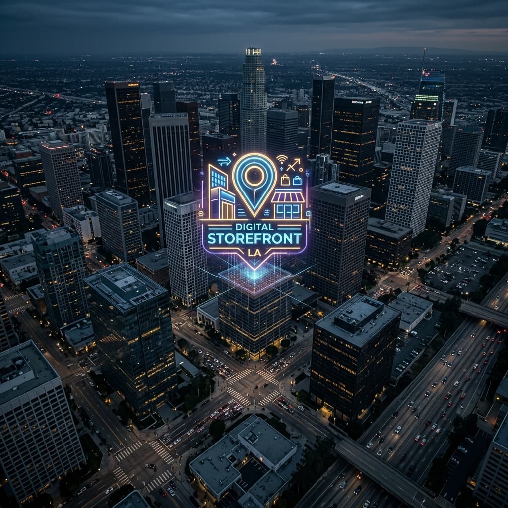
Rebuild Your Brand